Kellogg’s Frosted Flakes
Packaging Design
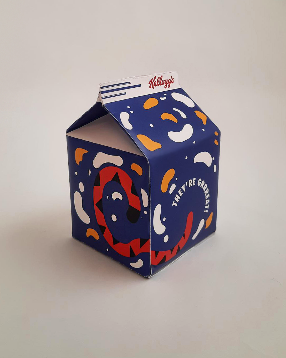
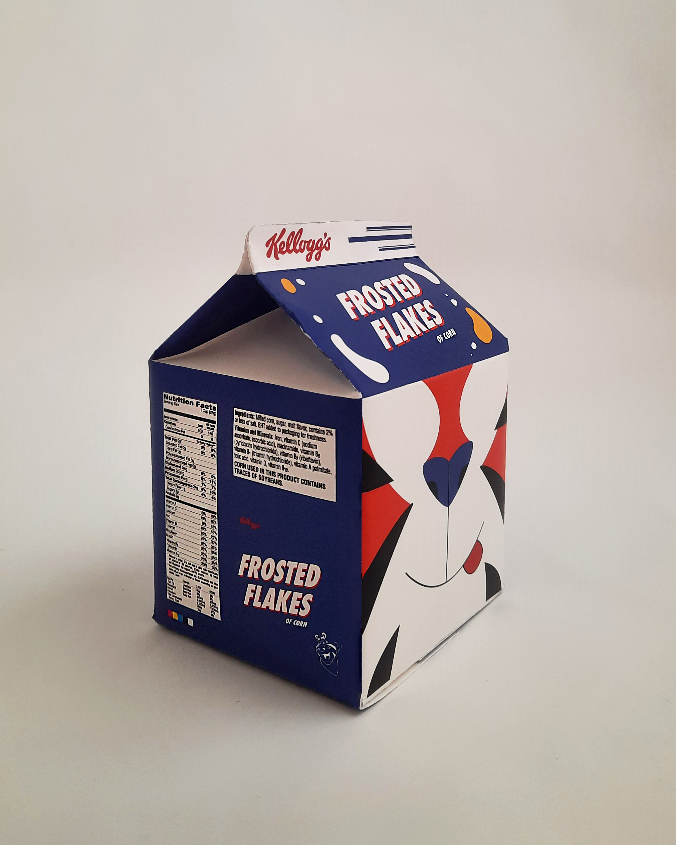
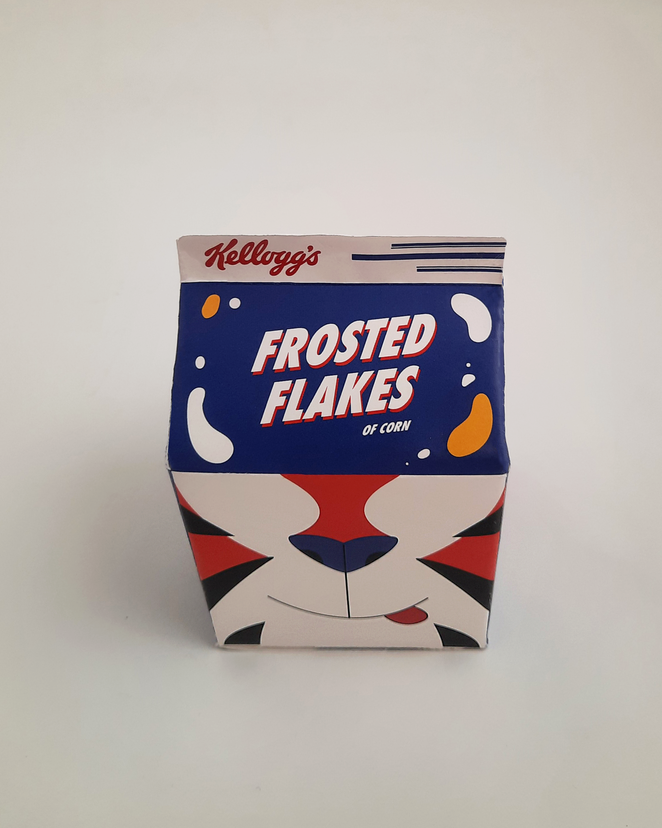
The process of rebranding personal-sized Frosted Flakes boxes, including sketching, prototyping, die-lines, and final product. The goal of this product was to invoke a nostalgic feeling while introducing a fresh new look.


The process!
The process!
Inspiration Moodboards:
My process always starts with gathering inspiration based on the concept I have in mind. For this project, I was looking at designers who used vibrant and retro colors, and vector-based graphics and had fun exploration of patterns and textures.

An important theme I wanted to keep in mind was making something fresh and new, while also having a nostalgic factor. This way, I could appeal to the younger audience with the fun color and imagery, while also staying true to the classic frosted flakes theme the adult audience grew up with.


Vibrant colors and contrast were very appealing to me as inspiration during this project as well.
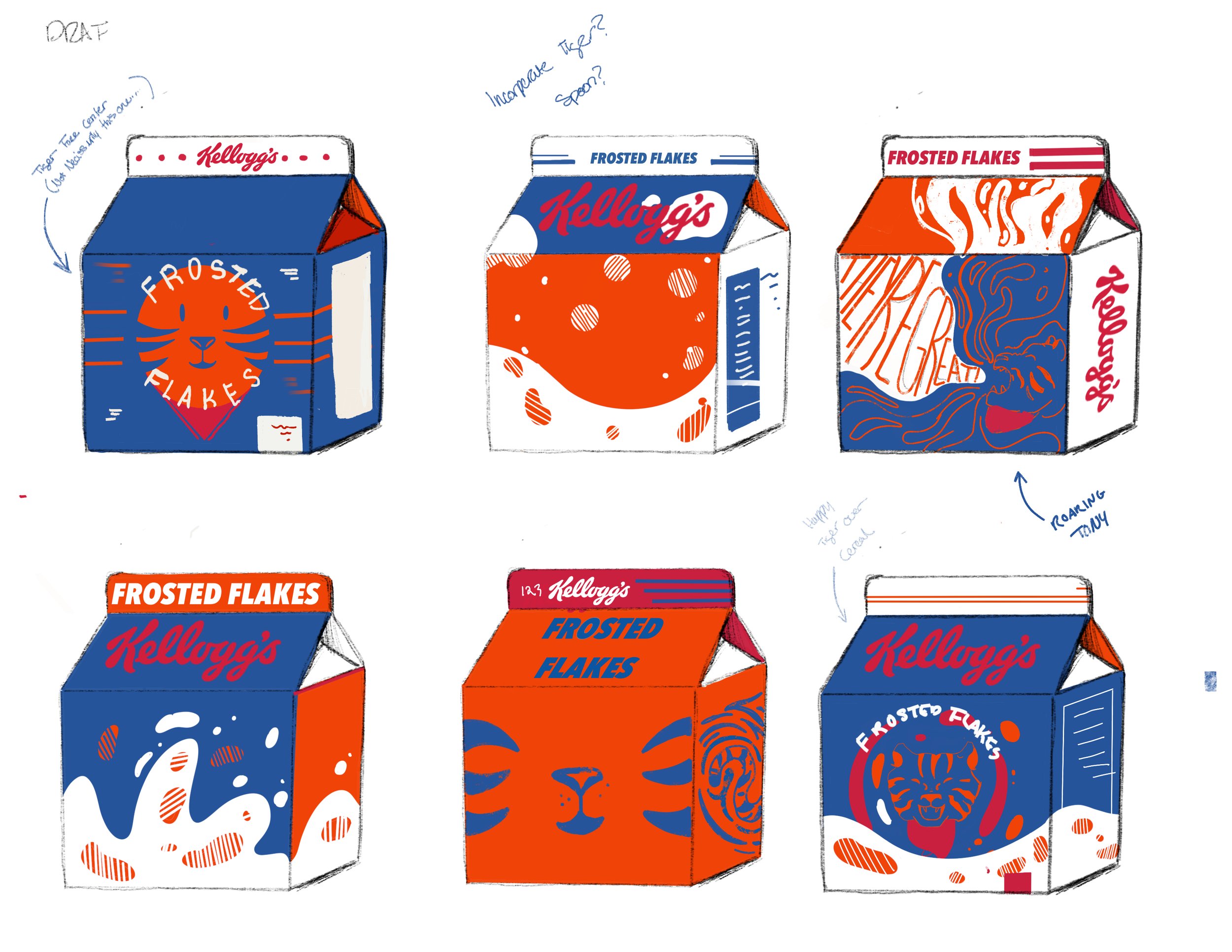
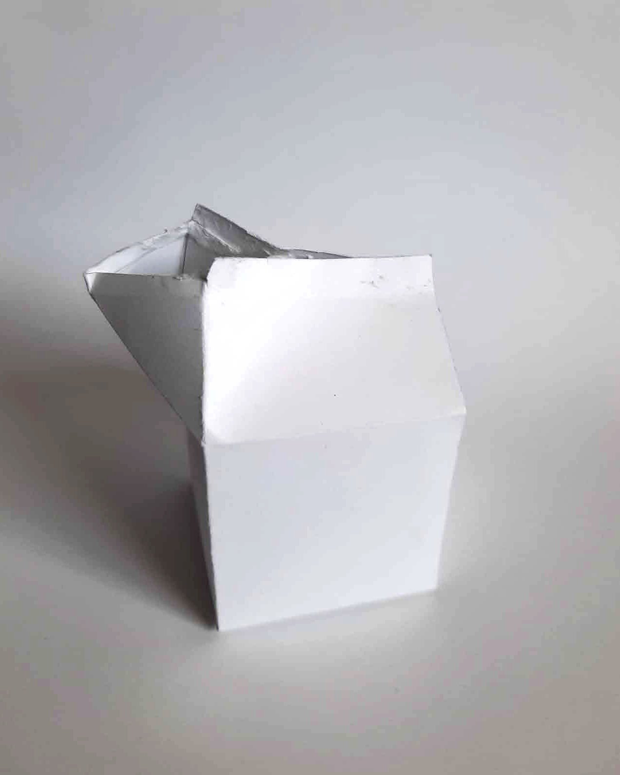
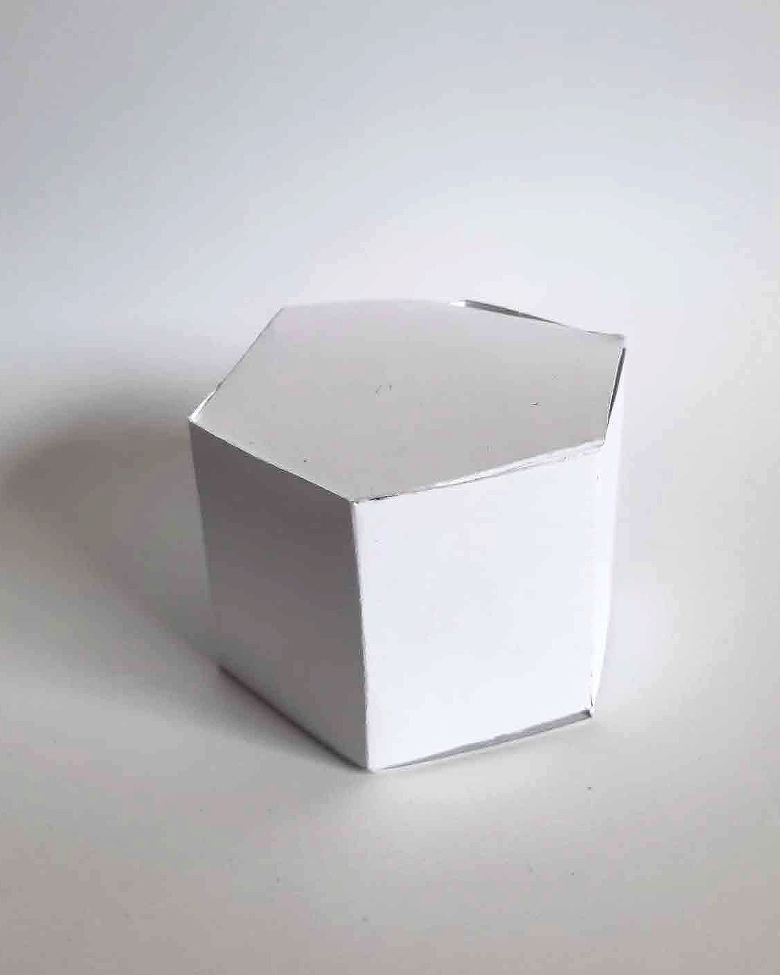
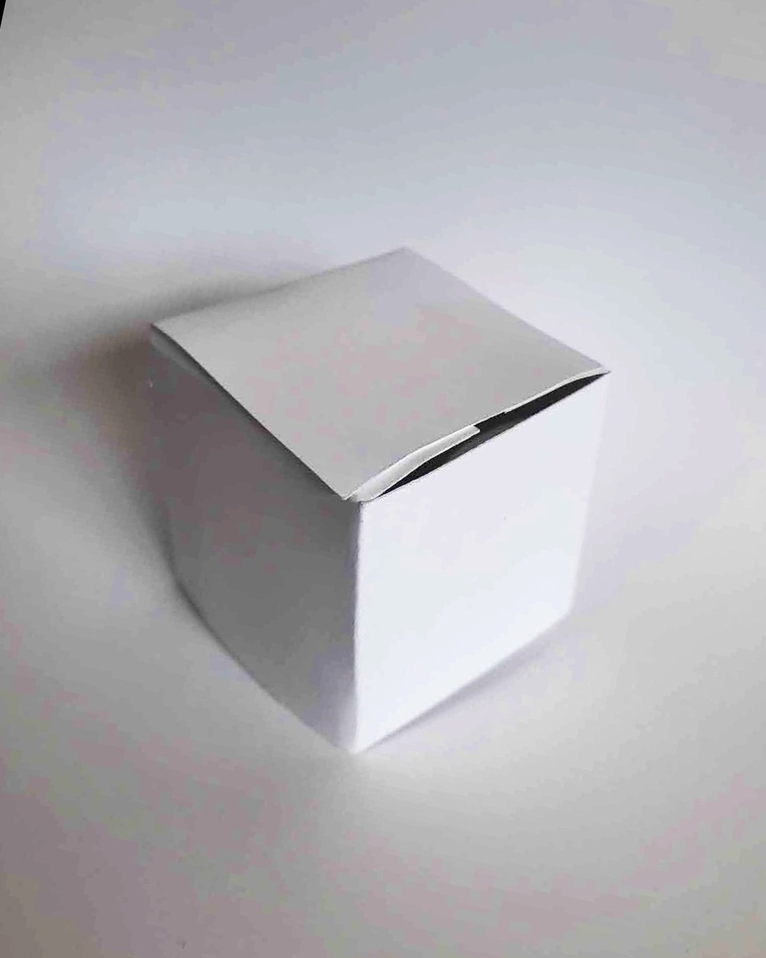
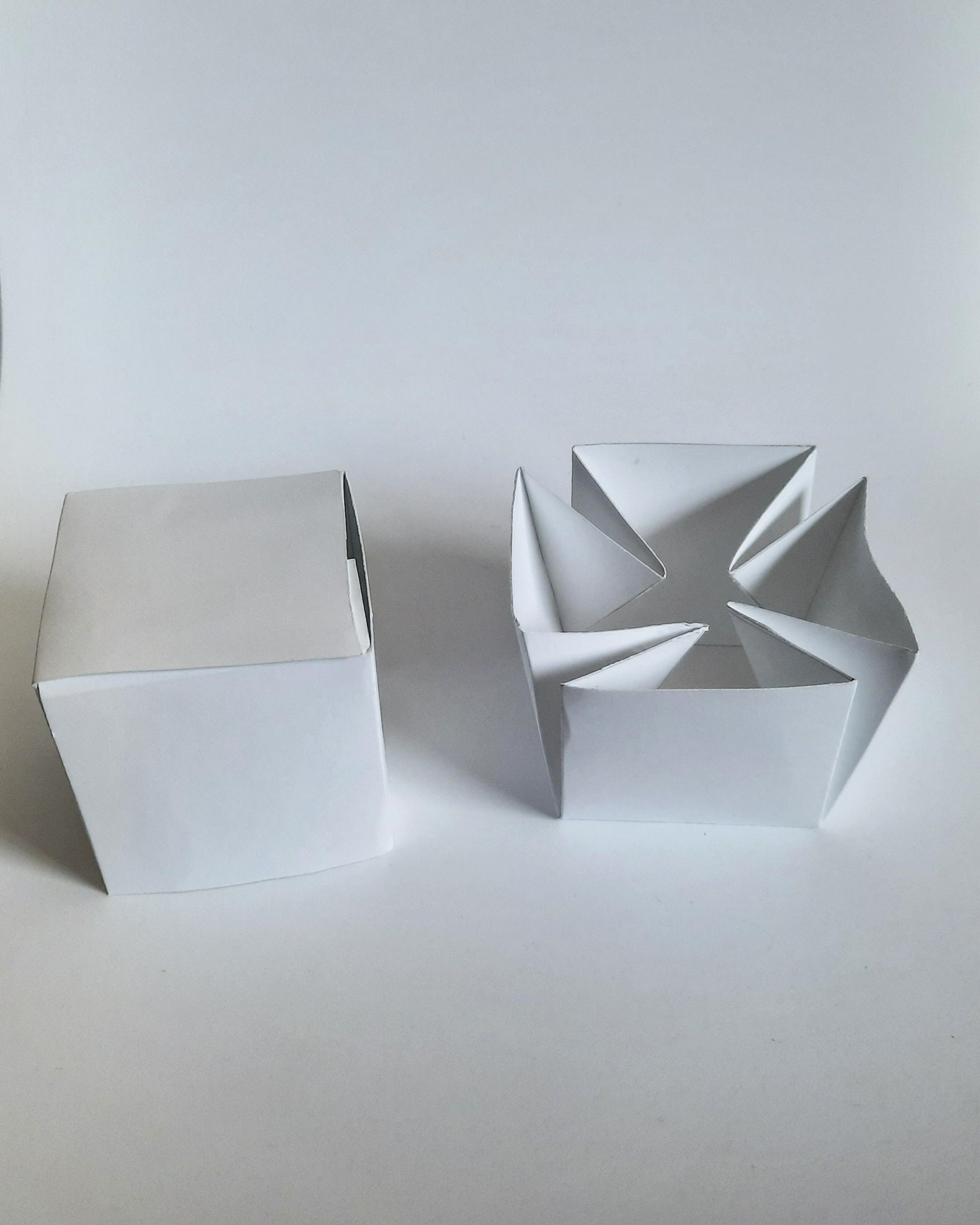
Paper Prototypes
For my packaging, I experimented with many different shapes and functions. Ultimately, I went with the milk carton, which could be opened and filled with milk, so you could eat right out of the box.


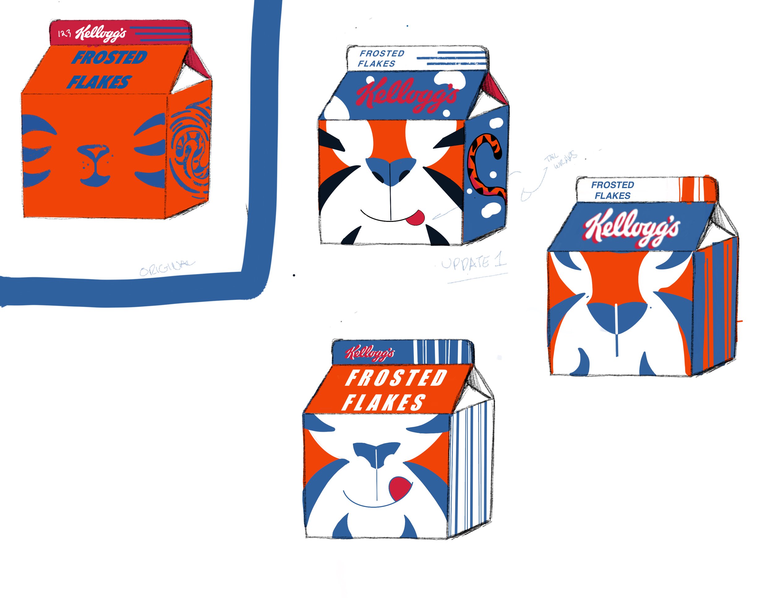
Final Sketches
Finally, I did some sketches of how I wanted my design to appear on the packaging, considering my mood board themes, and working with the 3D shape.